
Table of Contents
- Graphic Tee vs Plain T-Shirt: What's the Real Difference?
- Best Graphic Tees for Capsule Wardrobes
- How to Style Graphic Tees for Adults
- Plain T-Shirt Outfit Ideas for Every Occasion
- Longevity, Fabric Quality, and Trend Cycles
- Common Mistakes When Choosing Between Graphic and Plain
- Frequently Asked Questions
Last Updated: October 9, 2026
Graphic Tee vs Plain T-Shirt: What's the Real Difference?
The choice between a graphic tee vs plain t-shirt styling isn't about picking a winner. It's about understanding what each does best and when to wear it. At Lone Wolf Art, we've helped thousands of customers build wardrobes that actually reflect who they are, and the answer always comes down to intent.
A graphic tee is a t-shirt with a printed design, illustration, or text that becomes the focal point of your outfit. A plain t-shirt is a solid-colored tee that serves as a foundation piece. The difference matters because they do fundamentally different jobs in your wardrobe.
Versatility and Outfit Impact
Plain t-shirts win on versatility. They work with almost anything because they don't compete for attention. You can pair a plain tee with patterned pants, bold accessories, or layered pieces without visual chaos. The tee steps back and lets everything else shine.
Graphic tees work the opposite way. They demand attention. That's their job. When you wear a graphic tee, it becomes the statement. Your outfit revolves around it.
This doesn't mean graphic tees are less useful. It means they're purpose-built. They're for days when you want your shirt to do the talking. Plain tees are for days when you want everything else to work together.
Personality and Visual Interest
Here's what most people get wrong: plain tees aren't boring. They're neutral. There's a difference.
A plain tee in the right color creates visual interest through fit, fabric texture, and how you layer it. Think cream linen against a charcoal blazer. Think oversized cotton in a rich burgundy with tailored trousers. The tee becomes part of a composed look.
Graphic tees inject personality directly. They tell a story in one glance. T-shirt design trends for 2026 highlights nostalgic motifs, bubble lettering, varsity-inspired graphics, and punk-metal aesthetics as driving the current graphic tee market. That's personality. That's self-expression without explanation.
The trade-off: graphic tees are specific. A plain tee is a blank canvas. Choose graphics when you want to communicate something. Choose plain when you want flexibility.
Best Graphic Tees for Capsule Wardrobes
Not every graphic tee belongs in a capsule wardrobe. Most won't survive the rotation. The ones that do share specific qualities: they work across seasons, they pair with multiple bottoms, and they don't feel dated three months from now.
Choosing Designs That Last Beyond Trends
Trends cycle fast. What feels fresh today feels tired next year. The graphic tees that last are the ones that don't chase trends, they become them.
Look for designs with staying power. Minimalist text. Iconic symbols. Retro references that feel timeless rather than trendy. Graphic tee market analysis notes that graphic tees remain a wardrobe staple in 2026, with the primary shift being a move toward "unique, intentional designs" over generic prints.
Avoid novelty graphics tied to specific moments or inside jokes. Avoid overly busy designs with multiple colors and competing elements. Those designs fade faster, literally and figuratively.
The best graphic tees for capsule building are the ones you'd still wear in five years. That usually means clean design, meaningful imagery, and neutral color palettes that match your existing pieces.
Fit and Silhouette Matter More Than Design
Here's the part that changes everything: the design doesn't matter if the fit is wrong.
A stunning graphic on a poorly fitting tee looks like a costume. A simple design on a perfect silhouette looks intentional. Fit is where most people fail.
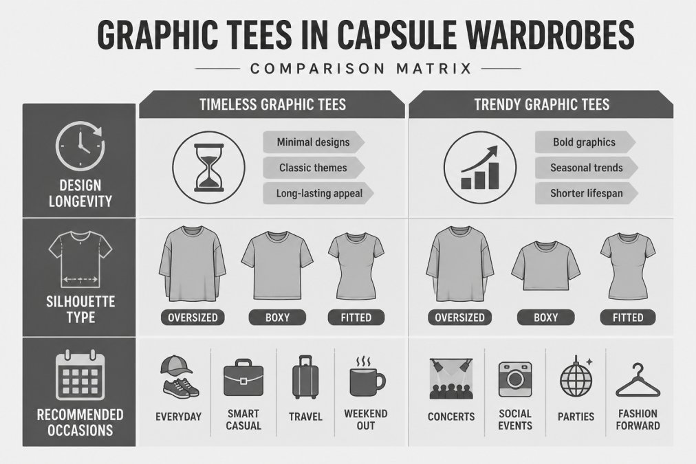
Fashion guidance for 2026 emphasizes that the "fashionability" of a t-shirt is heavily dependent on proportions, with oversized and boxy fits currently trending over traditional slim cuts.
Consider your body type and your existing pieces. If you wear tailored bottoms, an oversized graphic tee creates balance. If you wear loose-fitting pants, a fitted graphic tee prevents visual overwhelm.
How to Style Graphic Tees for Adults
Graphic tees don't have to read as casual or young. The difference is in execution. Adults wear graphic tees all the time, they just layer them differently.
Layering for Smart-Casual and Office Settings
The easiest way to elevate a graphic tee is to layer it. A graphic tee under an open linen shirt becomes smart-casual. The same tee under a structured blazer becomes office-appropriate. The shirt does the heavy lifting.
This works because the graphic becomes a peek rather than a statement. It's intentional without being loud. You're saying "I have personality" without saying "I'm not taking this seriously."
For professional settings, choose neutral layering pieces. Cream, gray, navy, black, or tan. The layering piece should be substantial enough to feel intentional, linen, cotton, or a structured blend.
The graphic itself matters here too. Avoid anything too bold or niche. Simple designs, meaningful symbols, and minimal text work. Busy graphics or controversial imagery undermine the professional effect.
Tucking, Proportions, and Silhouette Control
Tucking changes everything. A full tuck is too formal for most graphic tees. A front tuck is too trendy if you're not committed to the look. The sweet spot is usually a half-tuck or a subtle side-tuck.
Half-tucking a graphic tee creates proportion balance. It anchors the look without feeling staged. It works with jeans, trousers, or skirts. It signals intention without demanding attention.
Proportions matter here. If your graphic tee is oversized, a half-tuck prevents it from swallowing your frame. If it's fitted, a half-tuck adds visual interest to an otherwise simple silhouette.
Experiment with how much you tuck. Sometimes just tucking at the back works. Sometimes a small front tuck at one side. The goal is balance, not perfect symmetry, but visual equilibrium.
Plain T-Shirt Outfit Ideas for Every Occasion
Plain tees are the foundation. Build around them. The outfit's success depends on what you pair them with, not on the tee itself.
Building Around Your Color Palette
Color is where plain tees shine. The right color transforms a basic tee into a statement.
Warm skin tones usually work with cream, warm gray, camel, rust, and deep jewel tones. Cool skin tones usually work with white, cool gray, navy, and icy pastels. But this isn't law, it's a starting point.
The real trick is building a color palette. Choose three to four neutral tees that work together: cream, gray, navy, and black. Then build outfits around them. A cream tee with navy trousers. A gray tee with camel outerwear. A black tee with white sneakers.
Consistency in your neutral palette makes mixing and matching effortless. You're not thinking about whether colors clash, they don't, because you chose them intentionally.
Texture and Layering for Visual Depth
A plain tee in fine jersey (lightweight, smooth fabric) reads differently than a plain tee in heavier cotton. Texture adds visual interest without pattern.
Our Fine Jersey T-Shirt at Lone Wolf Art uses 100% ring-spun USA premium cotton, creating a lightweight canvas that works alone or layered. The smooth fabric drapes well, so the tee looks intentional even in simplicity.

Layering plain tees creates depth. A fine jersey tee under a chunky knit sweater. A plain tee under a textured linen shirt. The different fabric weights create visual interest and silhouette variation.
Texture also affects how the tee photographs and how it feels to wear. A substantial cotton tee (around 4.3 oz/yd²) holds its shape better through the day than a thin, flimsy tee. It looks more intentional. It lasts longer.
Longevity, Fabric Quality, and Trend Cycles
This is where the real difference emerges. Graphic tees and plain tees age differently.
Why Graphic Tees Fade and How to Prevent It
Graphics fade. It's inevitable. The print sits on top of the fabric, and washing, sun, and wear break it down over time. Some prints last years. Others fade in months.
Quality matters here. Screen-printed graphics on cheap blanks fade faster than prints on premium cotton. Digital prints fade faster than traditional screen prints. Prints on dark fabrics show fading more obviously than prints on light fabrics.
To extend the life of a graphic tee, wash it inside-out. This protects the graphic from direct friction. Wash in cold water. Avoid the dryer, air dry instead. The heat from dryers accelerates fading and shrinkage.
Choose graphic tees with designs you genuinely love, because they won't last forever. Plan for them to fade. Accept that as part of their lifecycle.
Plain Tees as Wardrobe Foundations
Plain tees, when made well, last for years. A quality plain tee becomes more comfortable as it ages. The fabric softens. The fit remains consistent because there's no print to crack or fade.
Our Short-Sleeve T-Shirt uses 100% ring-spun cotton (except heather blends) with double-stitched hems and shoulder-to-shoulder taping. That construction means it survives hundreds of washes without falling apart. The fabric weight (4.3 oz/yd²) gives it substance, it doesn't thin out or become see-through over time.

Plain tees are the pieces you build around. Buy good ones and rotate them. A rotation of five to seven quality plain tees in neutral colors means you always have something clean and ready. They're not exciting, but they're reliable.
Common Mistakes When Choosing Between Graphic and Plain
Most people choose wrong because they're thinking about the wrong thing.
Mistake 1: Choosing based on how the tee looks on the hanger. It matters how it looks on your body. Fit determines everything.
Mistake 3: Assuming plain tees are boring. They're not. They're versatile.
Mistake 4: Ignoring fabric quality. A cheap graphic tee and a cheap plain tee both disappoint. Cheap fabrics pill, shrink, and fade.
Mistake 5: Treating graphic tees and plain tees as interchangeable. They're not. They have different jobs. A graphic tee is a statement piece.
The real answer to graphic tee vs plain t-shirt styling is this: you need both.
At Lone Wolf Art, we focus on both.
Start with solid plain tees in neutral colors. Build your foundation. Then add graphic tees that genuinely speak to you.
| Consideration | Graphic Tee | Plain T-Shirt |
|---|---|---|
| Versatility | Limited to specific outfits | Works with almost anything |
| Visual Impact | Makes a statement | Supports other pieces |
| Longevity | Graphic fades over time | Improves with age |
| Styling Flexibility | Requires intentional layering | Works alone or layered |
| Wardrobe Role | Statement piece | Foundation piece |
| Best For | Self-expression, bold looks | Capsule wardrobes, basics |
Frequently Asked Questions
How do I style a graphic tee in 2026?
Layer it with intention. Oversized and boxy fits are trending, so pair your graphic tee with tailored trousers, a structured jacket, or an open overshirt to elevate it beyond casual wear. For fall 2026, avoid the standard jeans-and-tee formula by adding textured layering pieces. Keep your color palette cohesive, let the graphic be the statement, not competing patterns. Tucking the front or sides creates better proportions and works for smart-casual settings.
Can you wear a graphic tee for a smart-casual look?
Yes, with the right styling. Layer your graphic tee under a structured blazer, cardigan, or open linen shirt to transition it from casual to smart-casual. Pair it with tailored trousers or chinos instead of jeans, and choose graphic designs with intentional, unique artwork rather than generic prints. The key is proportions, oversized tees work best when balanced with fitted bottoms, and fitted tees pair well with relaxed trousers. Avoid busy patterns that compete with your layering pieces.
What's the difference between a plain t-shirt and a graphic tee in terms of versatility?
Plain t-shirts are the most versatile piece for capsule wardrobes because they support the rest of your outfit without competing for attention. They work as a base layer, a statement-free casual piece, or a foundation for bold accessories. Graphic tees, by contrast, make a look 'hit fast', they're designed to be visually prominent. Plain tees give you flexibility across seasons and occasions; graphic tees work best when intentionally chosen for their design's longevity and your personal aesthetic.
How do I choose between a plain tee and a graphic tee for layering?
Use plain tees as your layering base, they won't compete with outer pieces and work under jackets, cardigans, and overshirts. Graphic tees work as a layered statement when the design is intentional and timeless. If you're layering a graphic tee, keep the outer layer simple and let the graphic peek through. For oversized silhouettes trending in 2026, plain tees layer cleanly without adding bulk; graphic tees in boxy fits need more careful proportion management to avoid looking shapeless.